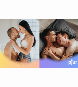


Wasserbillig, Luxemburg – pjur’s refreshed branding is already out there for all to see on the pjur plat- forms. But it’s the new colours and images that pjur is using to reposition itself after 27 years’ success that are most striking.
pjur’s new colour & image world
The brand doesn’t just have a new logo, new claim, and more defined vision and mission. The colours and images that pjur will use to shape its designs and communication in the future have also changed. pjur has chosen a completely new, very different colour palette, in addition to placing greater emphasis on shapes and using images that represent a lights on/lights off perspective:
Colour world
The new pjur colour palette combines radiant colours with limitless colour gradients. This includes a soft white, an intimate black and pjur yellow for unmistakeable branding. The pjur colour gradient runs through six different colours that cover all types of love, cultures and emotions. They are all at the same saturation level to forge a sense of belonging to each other.
Shapes
The new fluid shapes visualise the curiosity and enthusiasm for the magic sparked by pjur personal lubricant. The colour gradients themselves stand for diversity and openness. The shapes can all be adapted from a circle, like a soap bubble. In terms of its iconography, the soap bubble stands for fascination, lightness and unlimited dreams.
Lights on Imagine World
pjur stands for respect, so pjur switches the light on, demonstrating that no one needs to hide their sexual desires and preferences. That is why pjur visualises authentic and natural sexuality with the lights on image world in photos from real life of positive people with a natural look, in natural situa- tions with natural lighting. Light, indirect and soft light meets intimate and emotional moments.
Lights Off image world
pjur turns the light off to demonstrate the magic that pjur sparks. This helps to show the mysterious and delightful side of pjur, with intimate situations and body parts photographed in high contrast. Close-ups and interesting perspectives of thrilling moments are captured from a secretive, observa- tional perspective with the lights off. The focus is on aesthetic, sexy, natural and detailed shots of bodies and people interacting intimately.
You must be logged in to post a comment Login