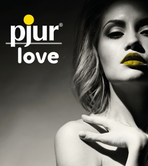


Fresh, modern, concise – these are the characteristics of the new pjur love logo. The new logo replaces the previous pjur elements of love logo and will also simplify the name of the product series. “The modified design lets customers navigate their way through our range even faster, enabling them to find their favourite products in our pjur product ranges love and med,” explains Michael Bart, Head of Global Marketing & Online Marketing.
The pjur love series contains products and ideas for everybody’s favourite past time. Whether alone or with a partner, young or old, experimental or conservative, the pjur love series has the right product for every target group when it comes to love. Reducing the previous three words to the key visual “love” directly re-flects the core topic at the heart of this series. Furthermore, the thicker, larger font is easier for the brain to take in and has been proven to make a brand more credible and trusted by consumers. The new font is modern and makes the logo recognizable. It is also easy to read at all times. “The soft contours also symbolize the premium quality of the brand and the respectful role that pjur plays in the intimate lives of our customers,” adds Alexander Giebel, CEO & Founder of the pjur group. “Our dealers will also benefit from these advantages.”
You can find out more about pjur at www.pjurlove.com
You must be logged in to post a comment Login